

Getting Started
Installation
Avatar
The Avatar component is used to represent a user, and displays the profile picture, initials or fallback icon.
Usage
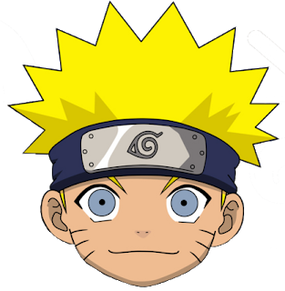
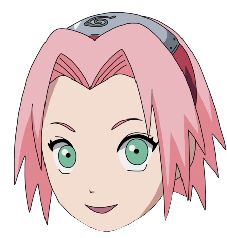
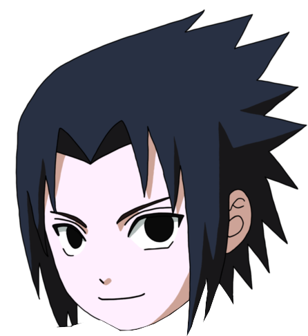
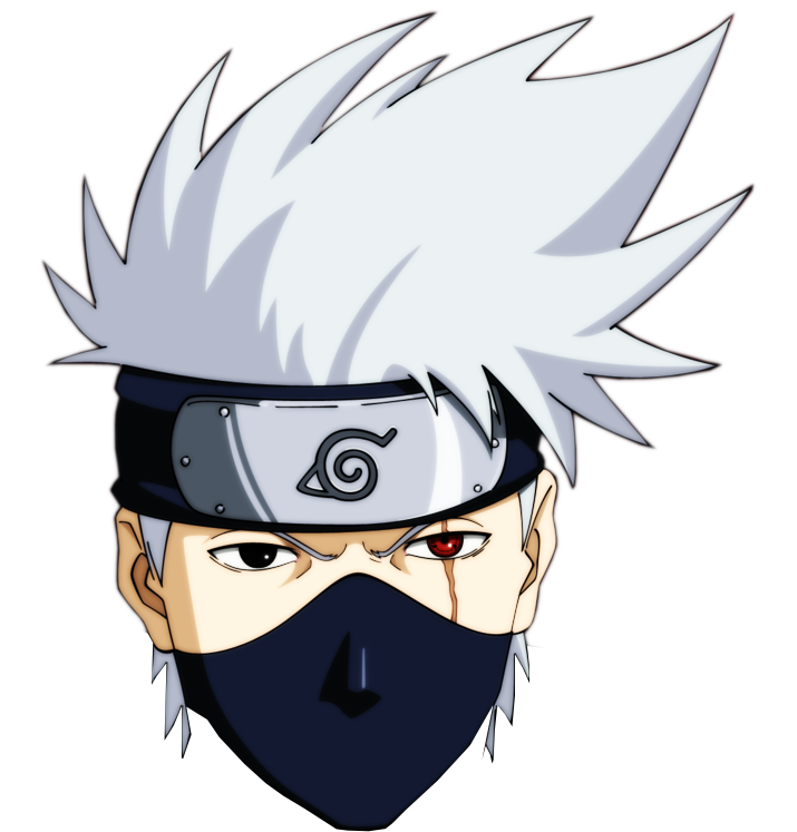
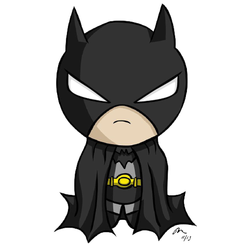
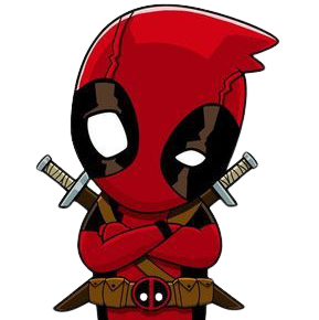
Avatar sizes
Avatar sizes can be modified by setting the width and height property of images.
Avatar Fallback
If there is an error loading the src of the avatar, these fallback avatar can be used:



Alert
Alerts are used to communicate a state that affects a system, feature or page.
Usage
 Success! Your data has been submitted successfully
 Warning! Your have not saved your data
 Error! We failed to save your data
 Info! Please save your data before submission
Badge
Badges are used to highlight an item's status for quick recognition.
Usage
Button
The Button component is used to trigger an action or event, such as submitting a form, opening a dialog, canceling an action, or performing a delete operation.
Usage
Button Variant
Choose the most suitable button of your need from the list of variants available.
Social Buttons
Buttons for social apps can be also used with icons.
Card
Cards contain content and actions about a single subject.
Usage

Some quick example text to build on the card title and make up the bulk of the card's content.
Complex cards/Cards with badges
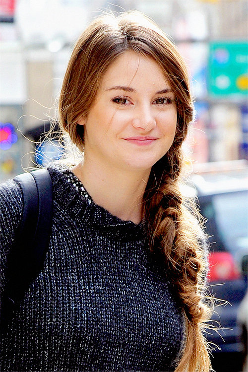
Girl's Black Top


30% OFF
Red Top
Kalakari inc.
Rs. 1399Image
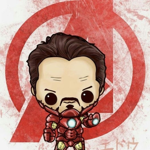
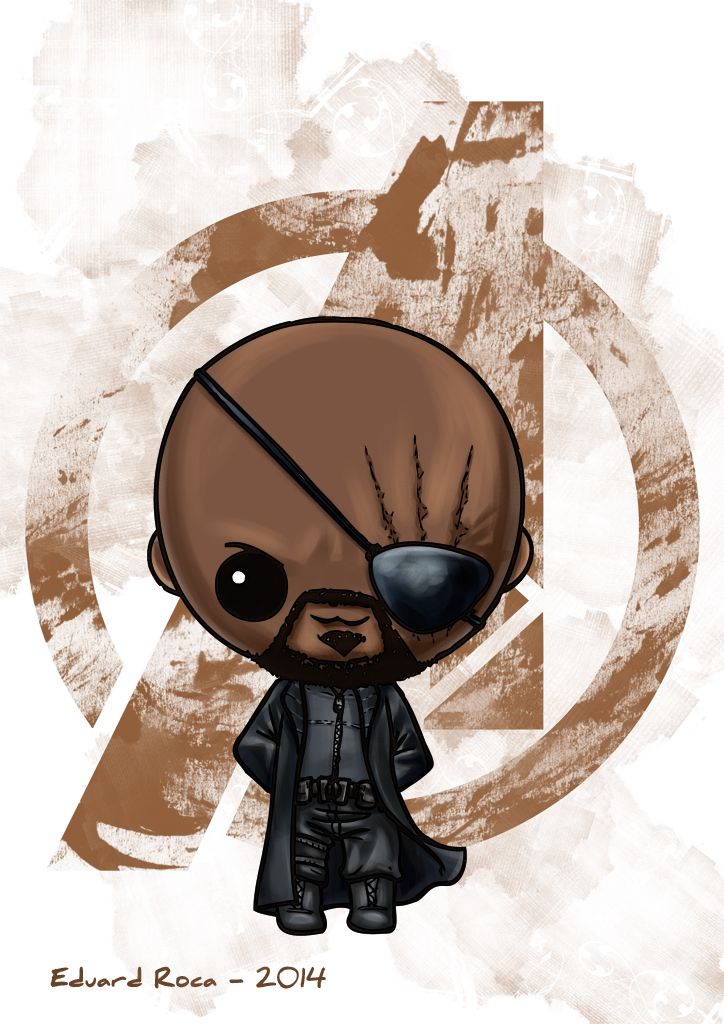
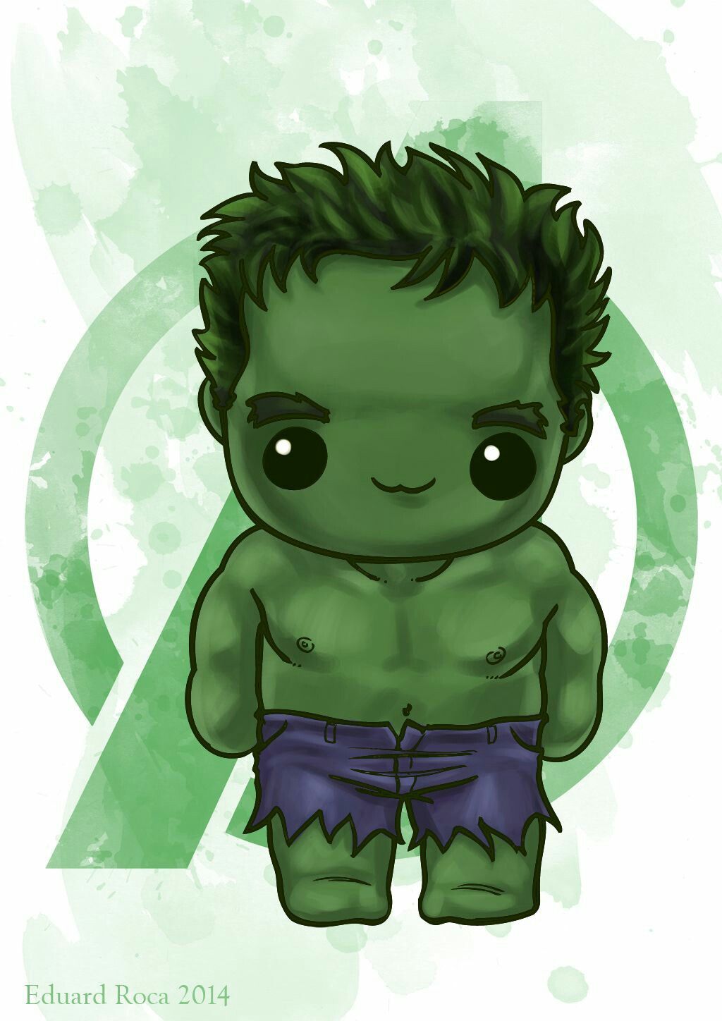
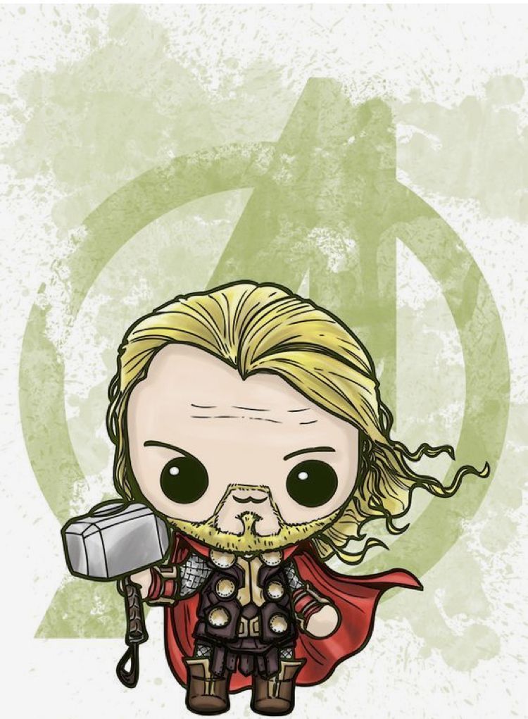
The Image component is used to display images.
Usage
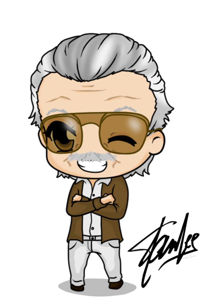
Size and Variant
Different variant and sizes of images can be used based on the requirement.
Input
The Input component is a component that is used to get user input in a text field.
Usage
List
Lists are continuous, vertical indexes of text or images.
Usage
Simple List
- Lorem ipsum dolor sit amet
- Consectetur adipiscing elit
- Integer molestie lorem at massa
- Facilisis in pretium nisl aliquet
Stacked List
-
I'll be standing where I belong. Between you and the people of NeoG.
-
Sometimes you gotta run before you walk.
-

Avengers Assemble!
Navigation
A navigation bar is a user interface element within a webpage that contains links to other sections of the website.
Usage
Desktop Nav
Typography
Use typography to present your design and content as clearly and efficiently as possible.
Usage
h1. Heading
h2. Heading
h3. Heading
h4. Heading
h5. Heading
Small text
This is a small text.
Gray text
This is a gray text.
Center text
This is a centered text.